Cumulative Layout Shift: Advanced Strategies to Stop UI Jitter
Cumulative Layout Shift (CLS) ruins user experience. Learn how to stop UI jitter using CSS containment and aspect-ratio properties for a stable interface.
Web PerformanceCSSFrontendCLSWeb VitalsLayout StabilityPerformance
Last month, our team noticed a sharp dip in our Core Web Vitals. The dashboard was loading, the data was populating, and suddenly—pop—the entire navigation menu jumped three inches south. It was a classic case of Cumulative Layout Shift (CLS). Users were clicking buttons that weren't there a millisecond before, and our support tickets regarding "broken UI" spiked.
We’ve all been there. You build a dynamic interface, you fetch data, and the DOM re-renders. If you aren't explicitly reserving space for that content, the browser has to guess, and it usually guesses wrong.
Identifying the Source of Cumulative Layout Shift
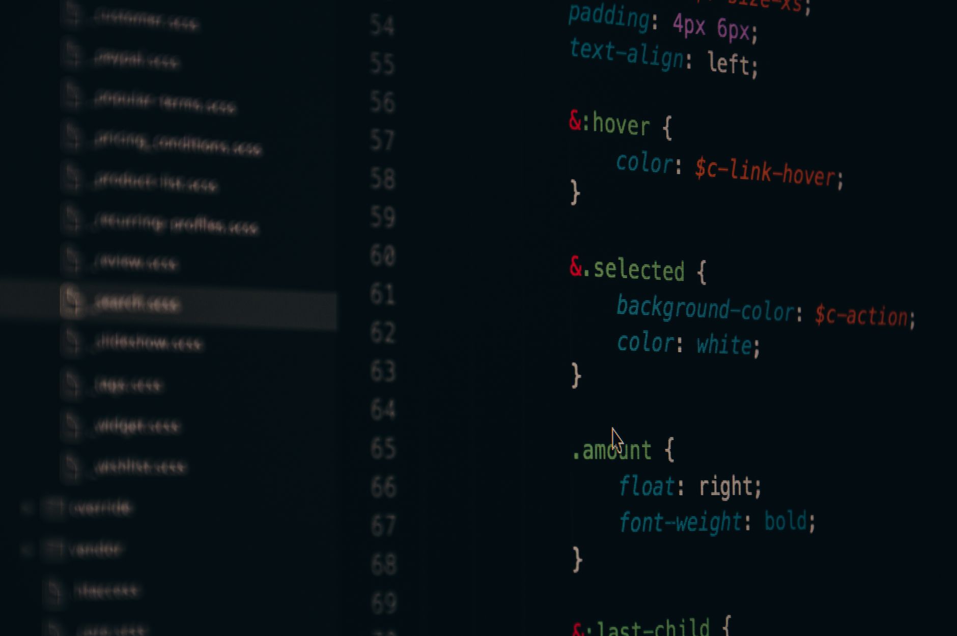
The first thing I did was open Chrome DevTools and head to the Performance tab. I recorded a page load and looked for the "Layout Shifts" track. It’s an eye-opener. I saw a massive shift occurring right when our side-panel widgets injected their content.
We initially tried to fix this with simple min-height declarations on our wrappers. It worked for some, but it broke our responsive mobile view. Hard-coding heights is a trap; it creates a rigid UI that doesn't respect the content. If you're dealing with similar stability issues, it's worth reviewing your Critical Rendering Path: Master Above-the-Fold Optimization to ensure that your initial paint is as predictable as possible.
Using the Aspect-Ratio Property
The aspect-ratio property in CSS is a game changer for CLS. Instead of guessing pixels, we tell the browser the relationship between the width and height of an element. Even if the content hasn't loaded yet, the browser knows exactly how much space to carve out.
Here is how we refactored our image and widget containers:
By adding this, the browser reserves a 16:9 box before the data arrives. When the image or component finally renders, it drops perfectly into that pre-allocated space. No shifting, no jitter, no frustrated users.
Moving Beyond Dimensions with CSS Containment
Sometimes, even with fixed ratios, third-party scripts or injected ads cause havoc. This is where contain comes in. It tells the browser that a specific element—and its subtree—is independent of the rest of the page layout.
I applied contain: layout size; to our widget wrappers. This effectively tells the browser: "Don't bother recalculating the layout of the entire page when this box changes."
Using content-visibility: auto is another trick. It skips the rendering work for off-screen elements, which helps with overall web performance and prevents the browser from doing unnecessary work that leads to layout instability. Just be careful; if you use size containment, you must set explicit dimensions, or the element will collapse to zero height.
The Trade-offs of Strict Containment
It wasn't all smooth sailing. When I first applied contain: size to our main dashboard grid, everything disappeared. Why? Because I hadn't set a height on the parent container. The browser saw the container had "no content" (because it was hidden/lazy-loaded) and collapsed the height to 0px.
I had to backtrack and combine aspect-ratio with min-height to ensure that even if the network was slow, the container held its ground. It’s a delicate balance. If you're managing complex state transitions, you might also want to look into Next.js App Router Layout Persistence: Mastering Shared State to ensure that your layout shells remain stable while your content fetches.
Why CLS Matters for Your Users
We saw our CLS score drop from a shaky 0.28 down to a rock-solid 0.04 after these changes. The "feel" of the app changed immediately. It moved from feeling like a "loading" experience to a "ready" experience.
If you are dealing with heavy data fetching, don't forget that how you handle your requests matters too. I've found that implementing INP Optimization: Strategies to Reduce Input Delay and Long Tasks alongside layout stabilization creates the most "snappy" feel for the end user.
Frequently Asked Questions
Is zero CLS possible?
Usually, no. Aim for under 0.1. Trying to reach absolute zero often leads to over-engineering and rigid designs that break on different screen sizes.
Does CSS containment work on all browsers?
Yes, contain has excellent support across all modern browsers (Chrome, Firefox, Safari, Edge). Just check the browser support tables if you need to support very old legacy versions of IE (though you probably shouldn't be).
Why does my image still shift even with width/height attributes?
If you have CSS overriding those attributes, the browser ignores them. Make sure your CSS isn't setting height: auto in a way that conflicts with your intrinsic aspect ratio.
Final Thoughts
I’m still not 100% satisfied with our current loading skeleton approach. While it prevents shifts, it sometimes feels like a "fake" speed boost. Next, I want to experiment with more granular server-side rendering to see if I can push the "first paint" even faster. Stability is the foundation, but perceived performance is where the real work happens. Keep testing, keep measuring, and don't trust your eyes—trust the Lighthouse report.
Master the Speculation Rules API for predictive prefetching. Learn how to drive instant navigation and improve Core Web Vitals without breaking your server.