Designing the Feature Grid: Building UI Layouts with Tailwind
Learn to design a professional feature section using Tailwind CSS. Master grid columns, card alignment, and semantic structure to create clean, responsive UI.
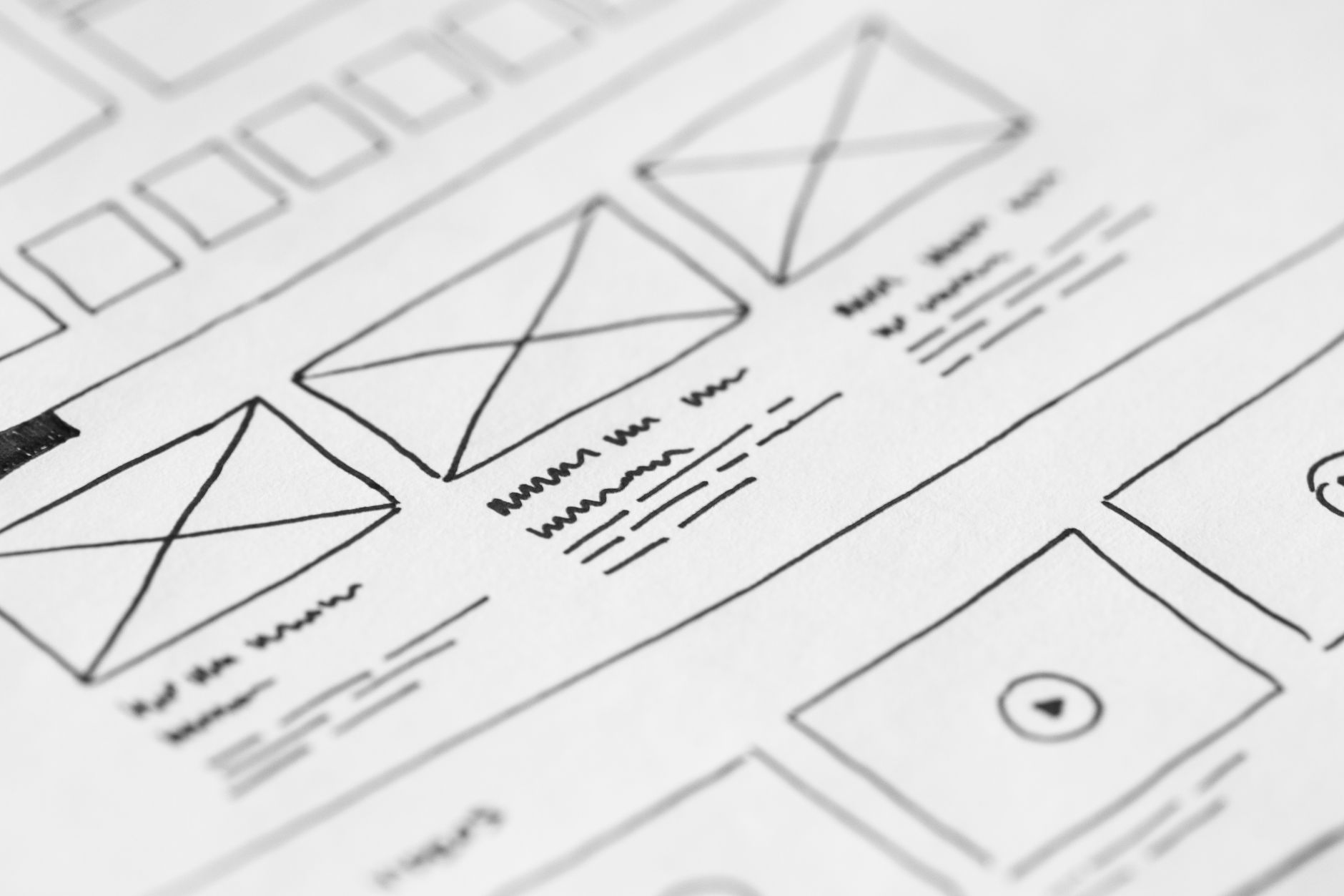
Previously in this course, we covered Grid Layout Fundamentals: Mastering Columns in Tailwind CSS to understand the mechanics of the CSS Grid engine. Now, we’re moving from theory to production by applying those concepts to our running project: building a clean, professional feature section for our marketing site.
A well-designed feature section is the backbone of any product landing page. It needs to be scannable, balanced, and structured in a way that guides the user's eye toward your core value propositions.
Structuring the Feature Section
Before applying any utility classes, we must define our markup. A feature section typically consists of a container for the entire block and individual cards for each feature.
Using semantic HTML helps screen readers and search engines understand your page hierarchy. We’ll use a section tag as the parent and div elements for our cards:
HTMLstyle="color:#808080"><style="color:#4EC9B0">section class="py-16">
  style="color:#808080"><style="color:#4EC9B0">div class="max-w-6xl mx-auto px-4">
    style="color:#808080"><style="color:#4EC9B0">h2 class="text-3xl font-bold text-center mb-12">Why Choose Us?style="color:#808080"></style="color:#4EC9B0">h2>

    <!-- The Grid Container -->
    style="color:#808080"><style="color:#4EC9B0">div class="grid grid-cols-1 md:grid-cols-3 gap-8">
      <!-- Feature Card 1 -->
      style="color:#808080"><style="color:#4EC9B0">div class="p-6 border rounded-lg shadow-sm">
        style="color:#808080"><style="color:#4EC9B0">h3 class="text-xl font-semibold">Speedstyle="color:#808080"></style="color:#4EC9B0">h3>
        style="color:#808080"><style="color:#4EC9B0">p class="mt-2 text-gray-600">Lightning fast performance for every user.style="color:#808080"></style="color:#4EC9B0">p>
      style="color:#808080"></style="color:#4EC9B0">div>

      <!-- Feature Card 2 -->
      style="color:#808080"><style="color:#4EC9B0">div class="p-6 border rounded-lg shadow-sm">
        style="color:#808080"><style="color:#4EC9B0">h3 class="text-xl font-semibold">Securitystyle="color:#808080"></style="color:#4EC9B0">h3>
        style="color:#808080"><style="color:#4EC9B0">p class="mt-2 text-gray-600">Enterprise-grade encryption by default.style="color:#808080"></style="color:#4EC9B0">p>
      style="color:#808080"></style="color:#4EC9B0">div>

      <!-- Feature Card 3 -->
      style="color:#808080"><style="color:#4EC9B0">div class="p-6 border rounded-lg shadow-sm">
        style="color:#808080"><style="color:#4EC9B0">h3 class="text-xl font-semibold">Supportstyle="color:#808080"></style="color:#4EC9B0">h3>
        style="color:#808080"><style="color:#4EC9B0">p class="mt-2 text-gray-600">24/7 dedicated assistance whenever you need.style="color:#808080"></style="color:#4EC9B0">p>
      style="color:#808080"></style="color:#4EC9B0">div>
    style="color:#808080"></style="color:#4EC9B0">div>
  style="color:#808080"></style="color:#4EC9B0">div>
style="color:#808080"></style="color:#4EC9B0">section>
Applying Grid Columns and Gaps
In the example above, the magic happens in the grid container. We use the following utilities:
grid: Initializes the display property togrid.grid-cols-1: Sets the layout to a single column by default (mobile-first approach).md:grid-cols-3: Prompts the grid to expand to three equal-width columns once the browser hits the medium (md) breakpoint.gap-8: Creates consistent gutter space between your cards without needing individual margins on the cards themselves.
By relying on the grid container to manage spacing and alignment, we ensure that adding or removing a feature card doesn't break the layout.
Aligning Feature Cards within the Grid
When you build a grid, your items naturally stretch to fill the height of their grid row. If your feature cards have varying amounts of text, you might notice that some cards look taller than others.
To maintain visual consistency, you can use flexbox inside the grid cells if you need complex alignment, or simply use padding to ensure the cards breathe. In the code above, the p-6 utility provides generous inner spacing, ensuring that even if one card has more content, the text doesn't hit the border.
Hands-on Exercise
- Add a fourth card to the existing grid. Notice how it automatically wraps to a new row on mobile but aligns to the three-column structure on desktop.
- Change the
gap-8togap-4. Observe how the layout tightens. - Add
text-centerto the card container class list to center-align the content inside each card.
Common Pitfalls
- Over-nesting: Avoid creating unnecessary wrapper
divelements. If the grid container can handle the layout, don't wrap items in extra divs unless they are strictly needed for styling purposes. - Ignoring Mobile: Always test your grid at small screen sizes. If you skip
grid-cols-1, you might end up with three squashed columns on a phone screen. - Hard-coding Heights: Never force a fixed height (e.g.,
h-64) on feature cards. Content is dynamic; if a user translates your site into a language with longer words, your fixed-height cards will overflow.
FAQ
Q: Should I use Flexbox or Grid for this section? A: Use Grid when you want strict, uniform alignment across rows and columns. Use Flexbox if you want items to vary in size or wrap based on their intrinsic width.
Q: How do I handle an unequal number of items? A: If you have 4 items in a 3-column grid, the fourth item will naturally take the first slot of the next row. Tailwind's grid utilities handle this automatically without extra configuration.
Recap
Building a feature section is about balancing structure and flexibility. By using a semantic section wrapper, an explicit grid container with responsive column definitions, and consistent padding utilities, you create a robust UI that holds up under different content lengths and screen sizes.
Up next: We will dive deeper into Responsive Design Principles to understand how to make our layouts adapt fluidly across all devices.
Work with me

Next.js Full-Stack Web App Development
A fast, SEO-ready full-stack web app built with Next.js 16 — from idea to deployed product, by an engineer who ships to production.

Next.js Website & Landing Page Development
A blazing-fast, SEO-optimized website or landing page in Next.js — the kind that loads instantly and ranks. Design-to-code, done right.