Focus and Active States: Mastering Accessibility in Tailwind CSS
Learn to style focus rings and active states in Tailwind CSS. Improve accessibility and user feedback for keyboard navigation with these essential modifiers.
Previously in this course, we explored Hover States and Modifiers in Tailwind CSS: Interactive UI Design, where we learned how to add subtle feedback for mouse users. While hover states are great for desktop interactivity, they don't help users who navigate via keyboard.
In this lesson, we’ll move beyond the mouse to ensure your site is inclusive and usable for everyone. By mastering focus and active states, you’ll provide the necessary visual cues that tell users exactly where they are on the page and what happens when they click.
Why Focus and Active States Matter for Accessibility
Accessibility isn't just about screen readers; it's about the "perceivable" aspect of the web. When a user tabs through your navigation or form inputs, the browser's default focus ring might look jarring or, in some designs, be completely hidden by aggressive CSS resets.
- Focus (
focus:): Triggered when an element (like a button or input) receives focus via keyboard navigation (Tab key). It tells the user "you are here." - Active (
active:): Triggered at the exact moment a user clicks or presses an element. It provides the "tactile" feedback that a request has been registered.
The Standard Interaction Lifecycle
| State | Trigger | Purpose |
|---|---|---|
| Default | None | Establishes the component's baseline appearance. |
| Hover | Mouse Enter | Indicates the element is interactive. |
| Focus | Keyboard Tab | Confirms selection for keyboard-only users. |
| Active | Click/Press | Signals that the action is currently being executed. |
Implementing Focus Rings with Tailwind

Tailwind provides the focus: modifier to apply styles only when an element is focused. For accessibility, you should always ensure there is a high-contrast visual indicator.
The most common pattern is adding an "outline" or a "ring." In modern CSS, we prefer ring utilities over outline because they offer better control over spacing and color.
Worked Example: A Accessible Button
Let’s refine the buttons in our marketing site project. We want them to have a clear focus ring that doesn't conflict with our branding.
HTMLstyle="color:#808080"><style="color:#4EC9B0">button
  class="bg-blue-600 text-white px-4 py-2 rounded-lg
         hover:bg-blue-700
         focus:outline-none focus:ring-4 focus:ring-blue-300
         active:bg-blue-800 active:scale-95 transition-all"
>
  Click Me
style="color:#808080"></style="color:#4EC9B0">button>
Breaking down the classes:
focus:outline-none: Removes the browser's default, often ugly, focus outline.focus:ring-4: Adds a 4-pixel thick ring around the button when focused.focus:ring-blue-300: Sets the ring color to a softer blue, ensuring high visibility against the dark background.active:bg-blue-800: Darkens the button color to show it has been "pressed."active:scale-95: Shrinks the button slightly, giving a physical "button press" animation.
Hands-on Exercise
Open the index.html file from our project. Locate your main call-to-action (CTA) button in the hero section.
- Add
focus:outline-noneandfocus:ring-2with a contrasting color likering-indigo-200. - Add
active:translate-y-0.5to make the button look like it’s being pushed down. - Refresh your browser and try tabbing through the page. Does the focus ring appear clearly? If it’s hard to see, increase the
ringwidth or change the color to something more distinct.
Common Pitfalls
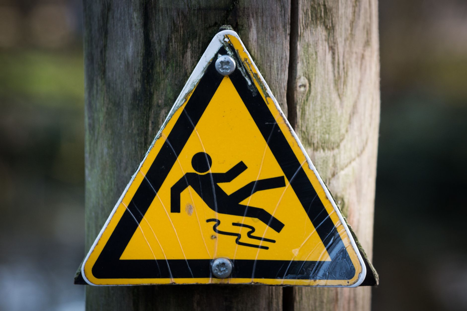
- Removing Focus Outlines without Replacement: Never use
focus:outline-noneunless you are immediately providing a different, high-visibility focus style. If you don't, keyboard users will get "lost" on your page. - Low Contrast Rings: Ensure your focus ring color provides enough contrast against your page background. A light gray ring on a white background is invisible.
- Ignoring the Active State: Users often wonder if a button click registered on slower connections. An
activestate provides instant confirmation that the click happened.
FAQ
Q: Do I need to add focus: to everything?
A: Only to interactive elements: <a> tags, <button> tags, and <input> or <textarea> elements. Don't add focus styles to static text or images.
Q: Why does my button look weird when I add a ring?
A: Sometimes the ring can cause layout shifts. Using focus:ring-offset-2 can help by adding a small gap between the button and the ring, which keeps the design clean.
Q: Is active the same as focus?
A: No. focus is about selection (navigation), while active is about the momentary action of clicking or tapping.
Recap
By combining focus: and active: modifiers, you create a robust user experience. You’ve learned that accessibility isn't an afterthought—it’s built into the utility-first approach by simply adding the right modifiers to your elements.
Up next: We will apply these principles to our forms as we begin Styling Buttons for our marketing site.
Work with me
Next.js Full-Stack Web App Development
A fast, SEO-ready full-stack web app built with Next.js 16 — from idea to deployed product, by an engineer who ships to production.
Next.js Website & Landing Page Development
A blazing-fast, SEO-optimized website or landing page in Next.js — the kind that loads instantly and ranks. Design-to-code, done right.